
Vyaas.G
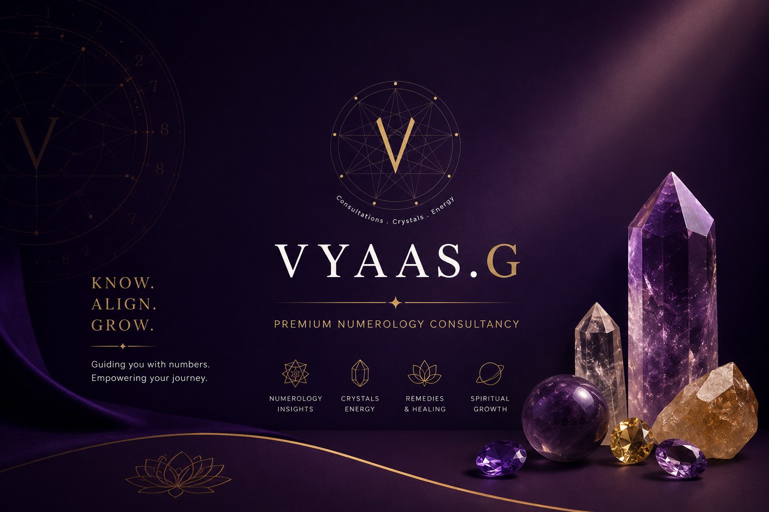
Transforming Vyaas.G into a premium, clear and user-focused brand experience.
Vyaas.G is a numerology and energy guidance brand offering personalised numerology consultations, crystal recommendations and energy-based guidance.
The brand had a strong foundation in numerology and crystal-based services, but its existing visual identity and report templates lacked consistency, clarity and a premium brand experience. Aeronovate worked on redefining the visual direction of Vyaas.G through a refined brand identity, purposeful colour system and a complete redesign of its personalised numerology report templates. The focus was not just to make the reports visually attractive, but to make the information easier to understand, easier to navigate and more engaging for the reader.
Industry
Numerology · Crystals · Energy Guidance
Services
Brand Identity · Visual Design · Report Template Design · UX/UI · Brand Communication
Role
Brand Strategy, Visual Identity, UX-Focused Report Design, Template System & Creative Direction
01 · The Challenge
The challenge
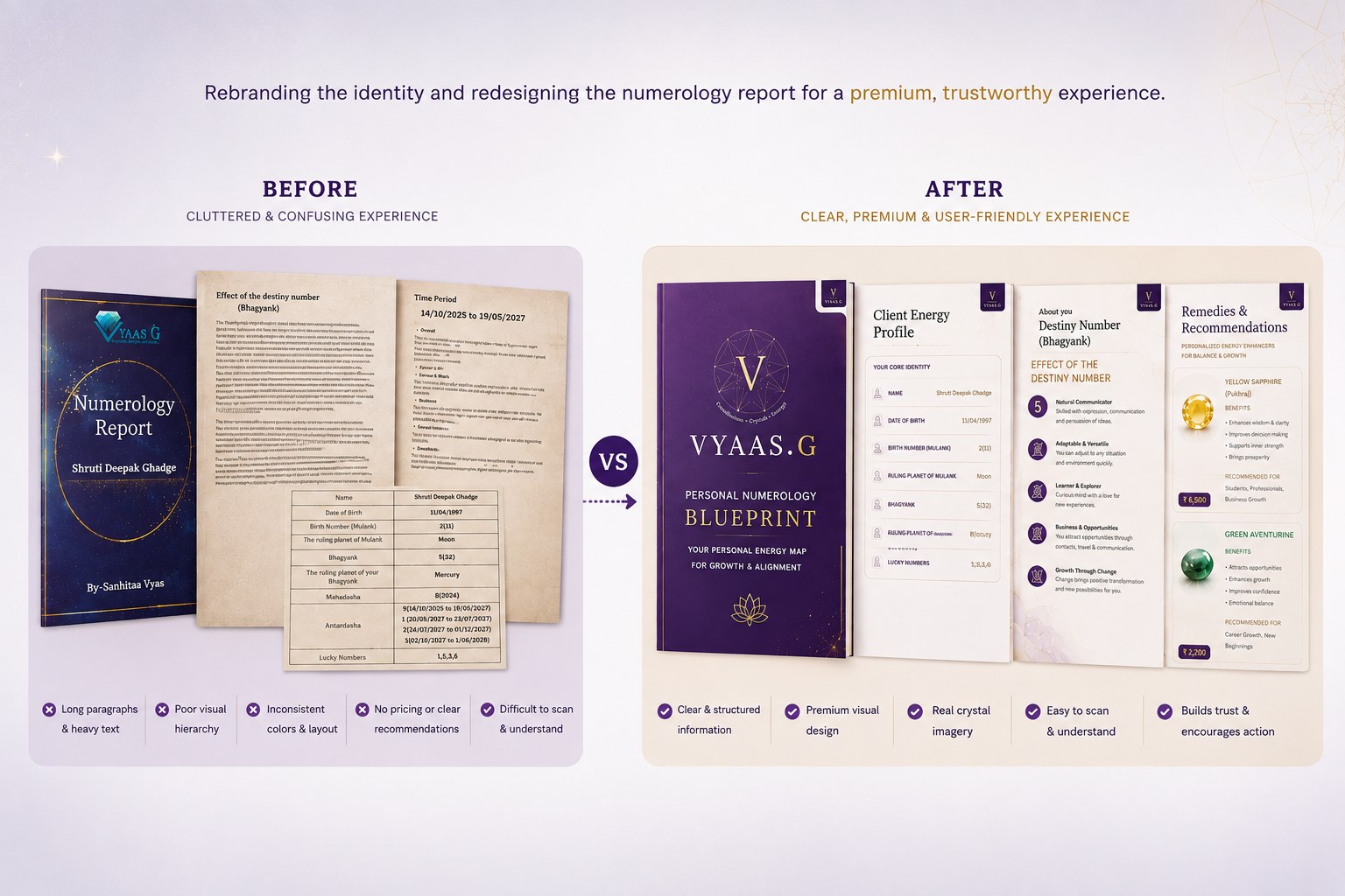
- Old brand identity: the logo and visual identity needed a more premium and meaningful direction.
- Cluttered templates: existing reports had too much information packed into each page.
- Long paragraphs: important numerology insights were difficult to scan and understand.
- Weak visual hierarchy: content lacked a clear reading flow.
- Inconsistent design and colours: the older visual style did not create a strong, consistent brand experience.
- Poor UX: the report felt more like a document than an easy-to-follow personalised experience.
- Limited crystal presentation: crystal and gemstone recommendations lacked strong, realistic visual representation.
- No clear pricing visibility: crystal recommendations did not clearly communicate pricing, making it harder for users to enquire confidently.
02 · Our Approach
Designing a clearer brand and report experience
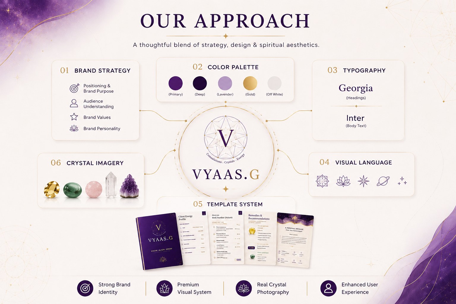
- Refined the brand identity with a meaningful Vyaas.G logo and premium visual direction.
- Established a new brand colour system using purple, plum, lavender, gold and off-white.
- Redesigned the report templates with a clean and consistent visual system.
- Improved UX through clear hierarchy, spacing and structured layouts.
- Replaced heavy paragraphs with pointers so information is easier to scan.
- Used Georgia for headings and Inter for supporting text.
- Added realistic crystal and gemstone imagery to make recommendations more tangible.
- Added crystal pricing to make recommendations more transparent and approachable.
- Created a reusable template system that can be applied across personalised numerology reports.
03 · Project Gallery
Project gallery
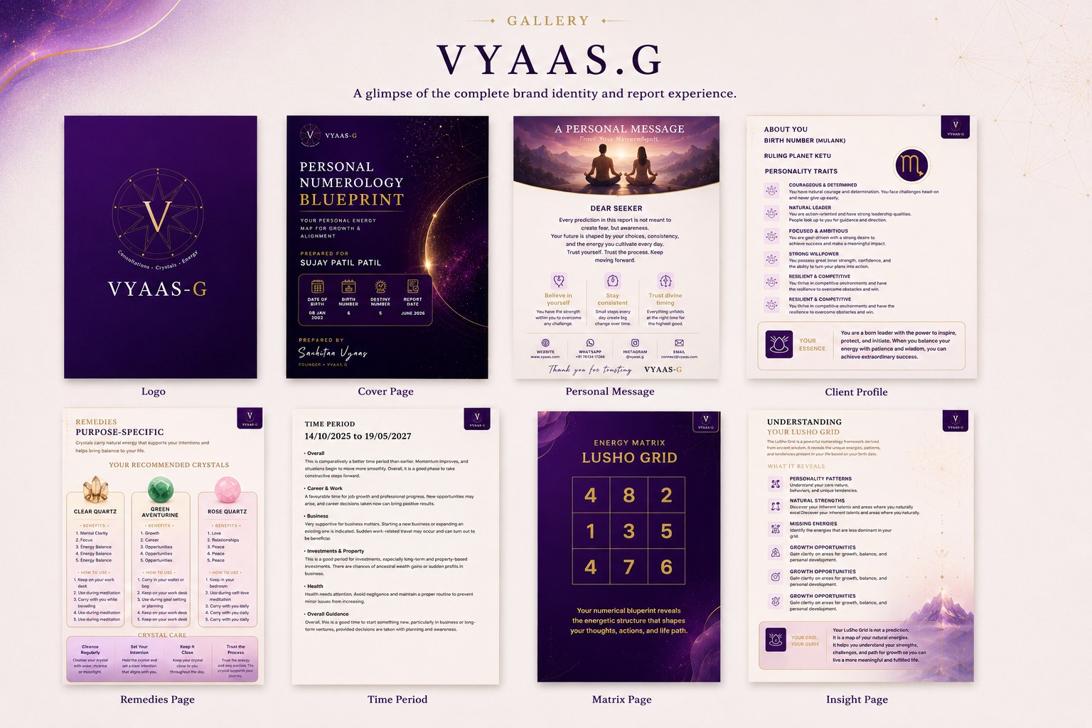
- Brand Identity
- Numerology Report Cover
- Personal Message
- Client Energy Profile
- Birth Number & Personality Insights
- Energy Matrix / Lusho Grid
- Guidance & Growth
- Missing Numbers Analysis
- Crystal Recommendations
- Crystal Care Guide
- Numerology Report Templates
- Premium Digital Report System