
Miracle Everyday
Turning everyday care into a warm, recognisable brand.
Miracle Everyday needed a brand system that could make care feel approachable, dependable and consistent across every communication touchpoint.
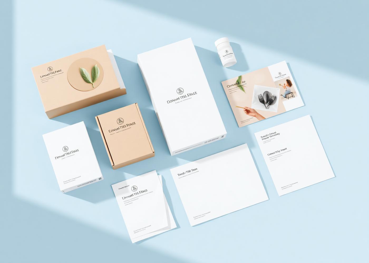
Industry
Healthcare / Wellness
Services
Brand Strategy · Brand Identity · Communication System
Role
Strategy, identity and communication direction
01 · The Challenge
The challenge
A broad wellness proposition can quickly become generic. The challenge was to create a distinct identity that felt credible and caring without becoming overly clinical or visually complicated.

02 · The Direction
The direction
The direction was built around the idea that meaningful care lives in everyday habits and moments. The brand needed to feel reassuring, simple and recognisable while supporting a growing range of communication.
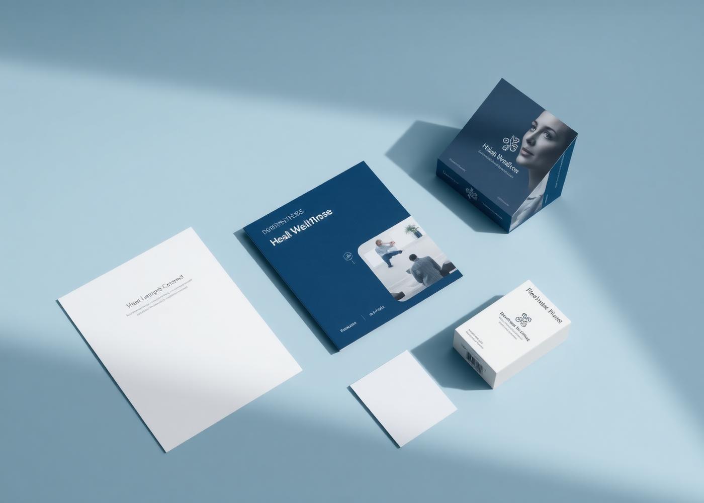
03 · The Identity System
The identity system
The system combines a clear recognition mark, considered typography, a warm visual language and adaptable communication principles. Each element was designed to keep the brand consistent without making it rigid.
04 · The Experience in Use
The experience in use
The identity was applied across product, collateral and everyday communication.
- Identity use
- Typography and colour
- Brand collateral
- Communication templates
05 · The Outcome
A flexible identity and communication system that brings warmth, clarity and greater consistency to the way the brand is presented.
06 · Gallery
Project gallery